Did you know the colors you use in your branding can make an impact? A digital marketing agency in Orange County widely believes it can influence people’s feelings and emotions towards products and services. In fact, most of the biggest brands in the world utilize color psychology to affect customers’ perceptions of them and their purchase decisions!
Let’s take a look at some colors, their meanings, and popular examples.
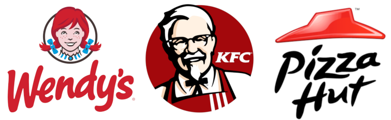
1. Red
Red is a particularly stimulating color and is the most popular color in marketing. It is the color of passion and excitement, and it catches people’s attention immediately. Perhaps this is why it invokes a sense of urgency in customers, encouraging them to buy goods quickly, and why many stores use it for flash sales.
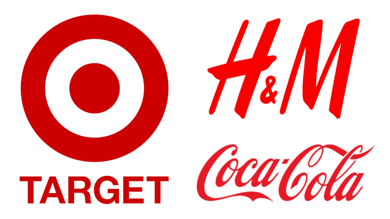
It also encourages appetite. If you’ve noticed, a lot of the biggest fast-food chains in the world have red logos!
2. Orange
Orange tends to get too bright and overwhelming, which is why brands tend to avoid using it as the sole color. However, when combined with the right colors, orange can have a friendly, sociable, and energetic vibe. It also exudes power.

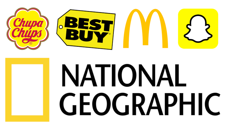
3. Yellow
Yellow is the lightest color in the color spectrum. It is the color of sunshine—it is uplifting, illuminating, and comforting to your audience. It is also associated with feelings of joy, kindness, playfulness, youthfulness, hope, and fun. Interestingly, it also gives off affordability.
So, if your brand is going for a homely and inquisitive sort of vibe, yellow is the color for you.
4. Green
Green is the color of nature, so many brands that use green logos are health-related or environment-related ones. It promotes a healthy lifestyle and a love for the environment. It also makes people more relaxed and down-to-earth.
Additionally, green is the color of money. It’s associated with wealth, fortune, and luck.

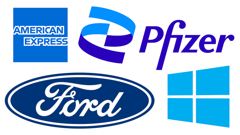
5. Blue
Blue is the color of the sky and the sea. It invokes feelings of peace, trust, security, and maturity. Brands use blue to show off how reliable their products and services are and how professional and confident their company is.
If you’re working in any of the medical and healthcare, automobile, IT and electronics, or finance industries, blue is an awesome color to make a logo with.
6. Purple
Purple is the color of uniqueness. It is the color of imagination, creativity, and whimsicality.
Purple also radiates class, nobility, and power. In the olden days, purple fabric was extremely hard to make because the color wasn’t commonly seen in nature. Thus, only those rich enough like kings, queens, and the nobility, could wear them.
Lastly, purple is calming yet mysterious. It’s associated with divine spirituality.
Out of all the colors in this list, purple is one of the most versatile and powerful—it conveys lots of emotions depending on how you use it. Surprisingly, though, not a lot of brands use it.

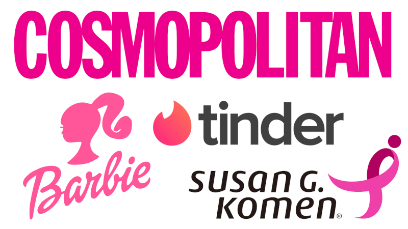
7. Pink
Pink is described as a feminine color and has long been associated with women. Most brands that have pink in their logos are relevant to femininity, childhood, or romance. If your demographic is largely women, it might be a good idea to incorporate pink in your logo too.
8. Black and White
Well, black and white aren’t really colors, but you get our drift.
Black and white are the simplest and most basic of colors and yet pack a punch. It’s strong, bold, and authoritative. Any brand that uses them is extremely secure and confident—almost as if they don’t need colors to attract anybody’s attention as their reputation speaks for itself. Indeed, many well-established giants in the business world have no color.
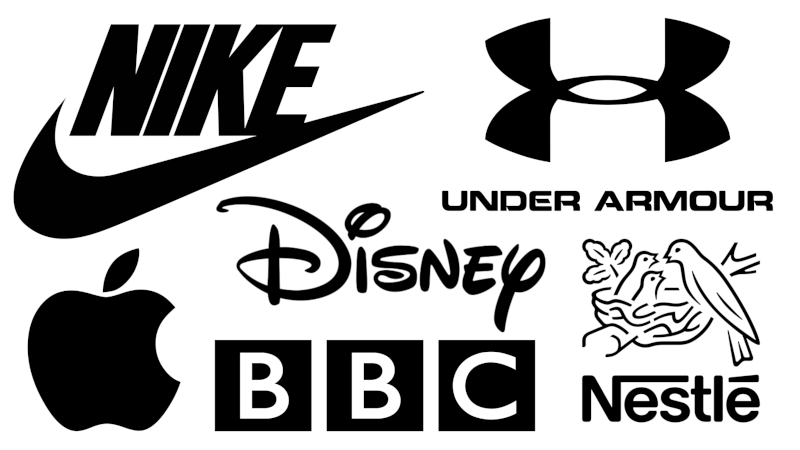
Black and white are also sleek and sophisticated. A little black dress and black tuxedo are timeless classics that will never go out of style, which is probably why many luxury brands use black in their logos too.

Lastly, and surprisingly, they have the added advantage of being the cheapest. You don’t need any colors to print in black and white. It blends in well and makes product production cheaper too. You could put a black and white logo onto any sort of product or any type of content and it’ll look great.
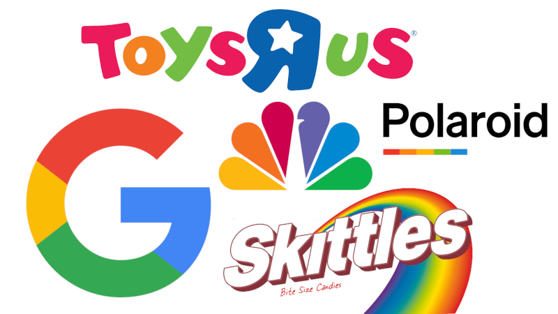
9. Rainbow
While black and white are the absence of colors, rainbow logos have all the colors! They’re super fun and eye-catching. It’s often used by photography-related brands to show how colorful and vibrant their goods and services are.
Rainbow logos also suggest diversity and versatility in their company. It shows they’re multitalented and have lots to offer to their customers.
Conclusion
If you’re developing a logo for your business or looking to rebrand, or want to update your Orange County web design or web hosting, you should pay attention to color. You can use color psychology to garner emotions from your customers and give off particular vibes. From this article, we’ve seen how many big-name and high-end brands have built their images with just color alone.